Modern layouts use a grid system to align elements and define their responsive behavior. Tailwind uses a classic 12 columns grid but allows you to adjust this grid whenever your layout requires this. In this example, we're using the Tailwind CSS grid class to create a responsive layout for 8 elements.
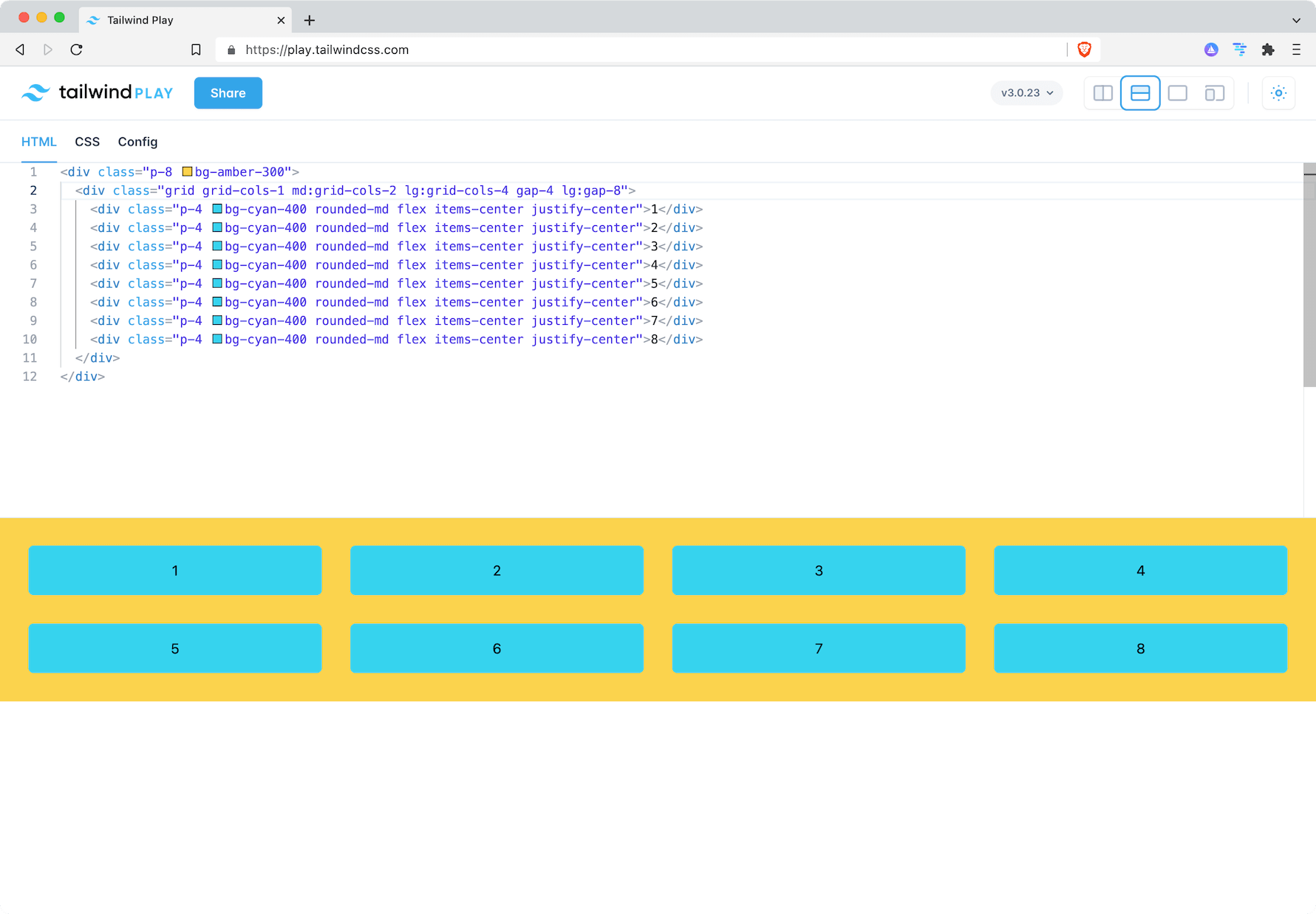
The final code of the grid will be:
<div class="p-8 bg-amber-300">
  <div class="grid grid-cols-1 md:grid-cols-2 lg:grid-cols-4 gap-4 lg:gap-8">
    <div class="p-4 bg-cyan-400 rounded-md flex items-center justify-center">1</div>
    <div class="p-4 bg-cyan-400 rounded-md flex items-center justify-center">2</div>
    <div class="p-4 bg-cyan-400 rounded-md flex items-center justify-center">3</div>
    <div class="p-4 bg-cyan-400 rounded-md flex items-center justify-center">4</div>
    <div class="p-4 bg-cyan-400 rounded-md flex items-center justify-center">5</div>
    <div class="p-4 bg-cyan-400 rounded-md flex items-center justify-center">6</div>
    <div class="p-4 bg-cyan-400 rounded-md flex items-center justify-center">7</div>
    <div class="p-4 bg-cyan-400 rounded-md flex items-center justify-center">8</div>
  </div>
</div>
But let's set up Tailwind Play with our plain content first.
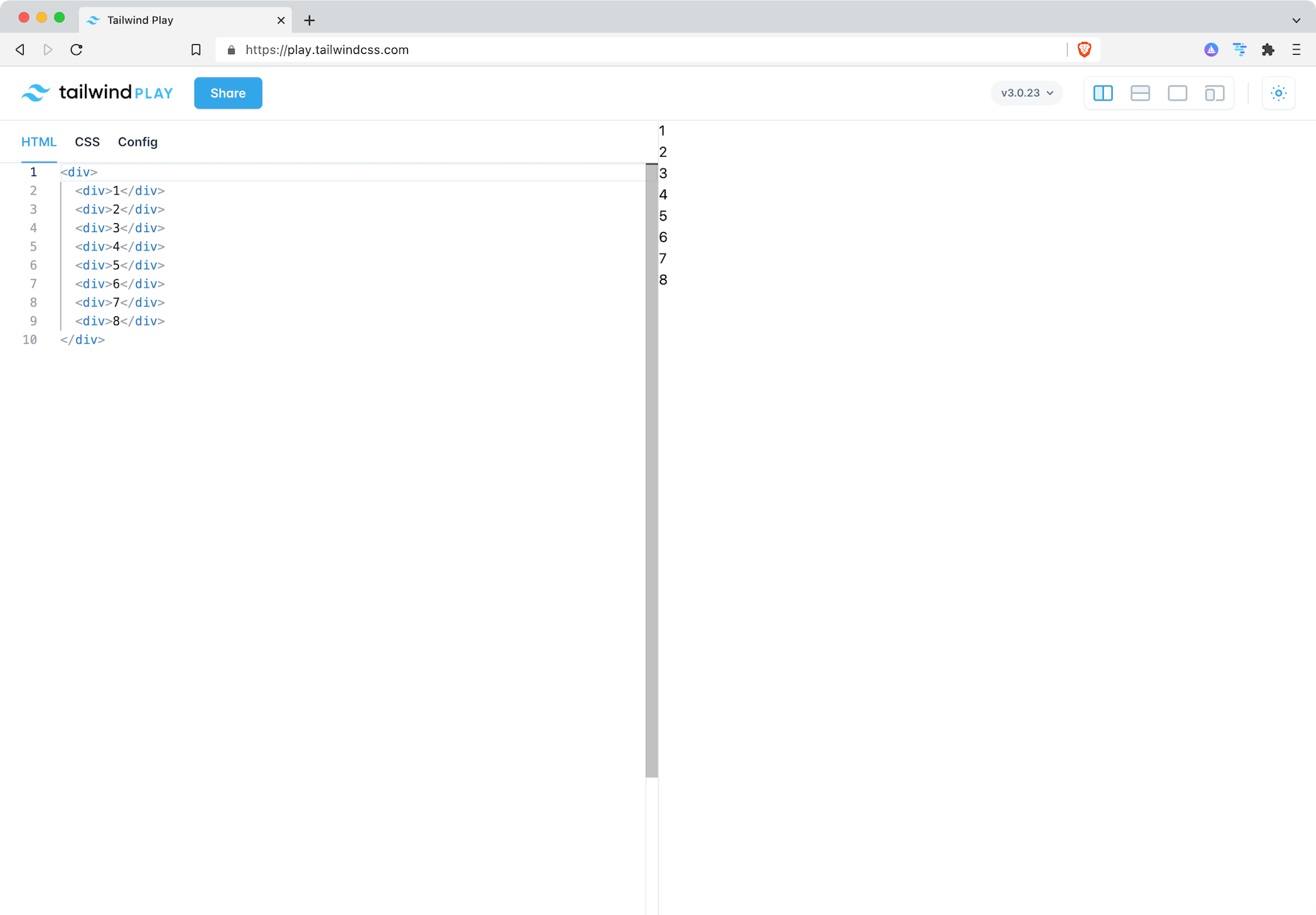
This content makes it hard to see how the grid layout works and what the Tailwind classes actually do. So we'll add some colors and align the content of the Tailwind grid for better understanding. This is also a common practice when implementing design grids. Start with colorful elements to get the visual hirarchy and replace them with their content once the Tailwind grid is set up to your liking.
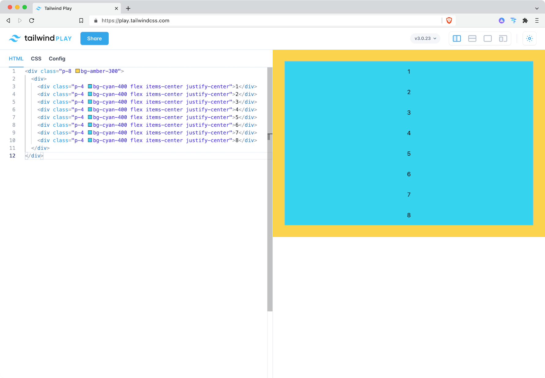
Adding the Tailwind grid
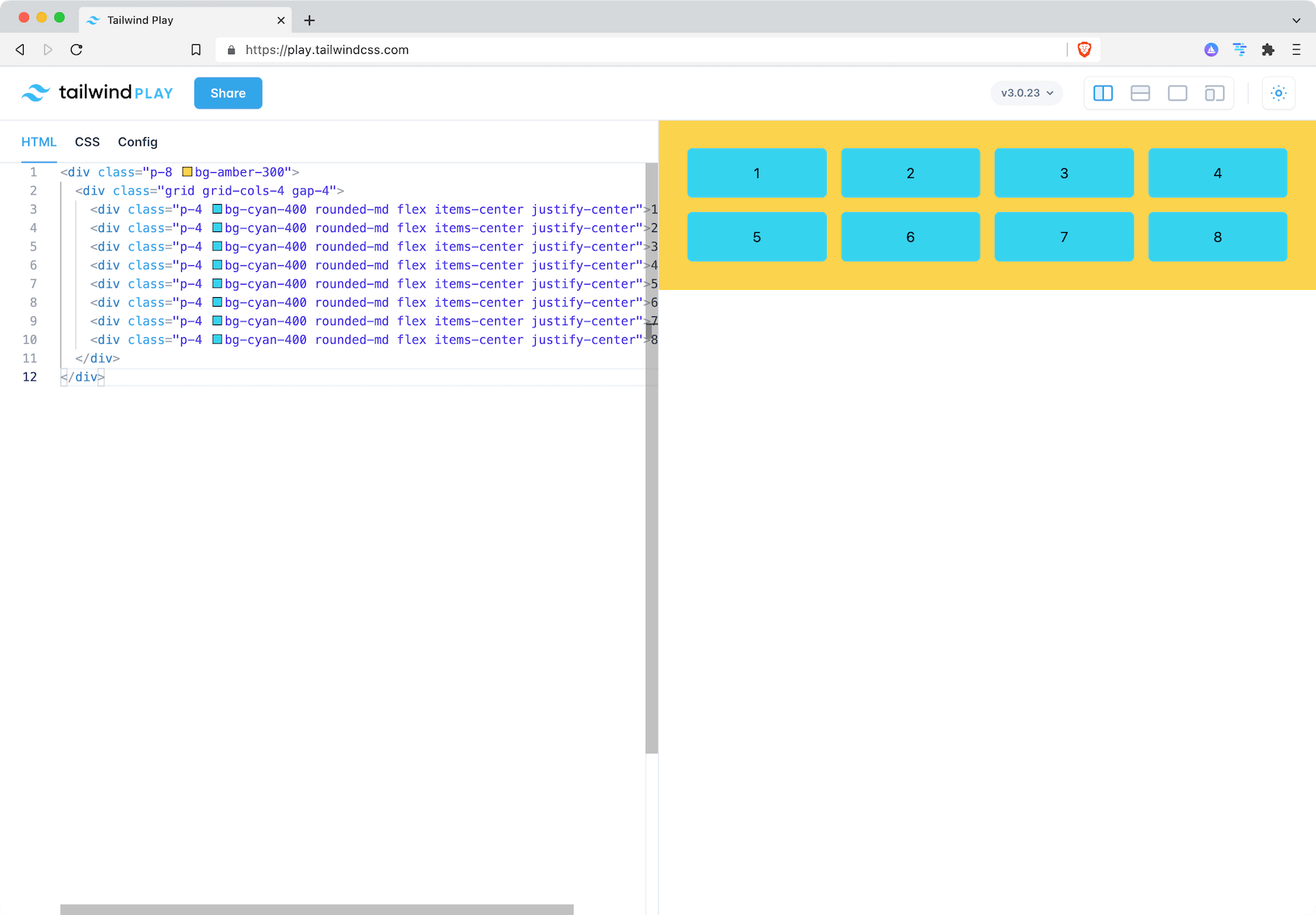
Tailwind makes it easy to place these items in a grid. Simply add the grid class to the parent element and define how many colums you need with the grid-cols class. In this example, we're using grid-cols-4.
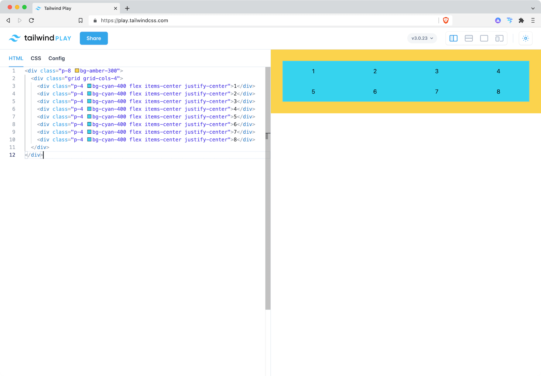
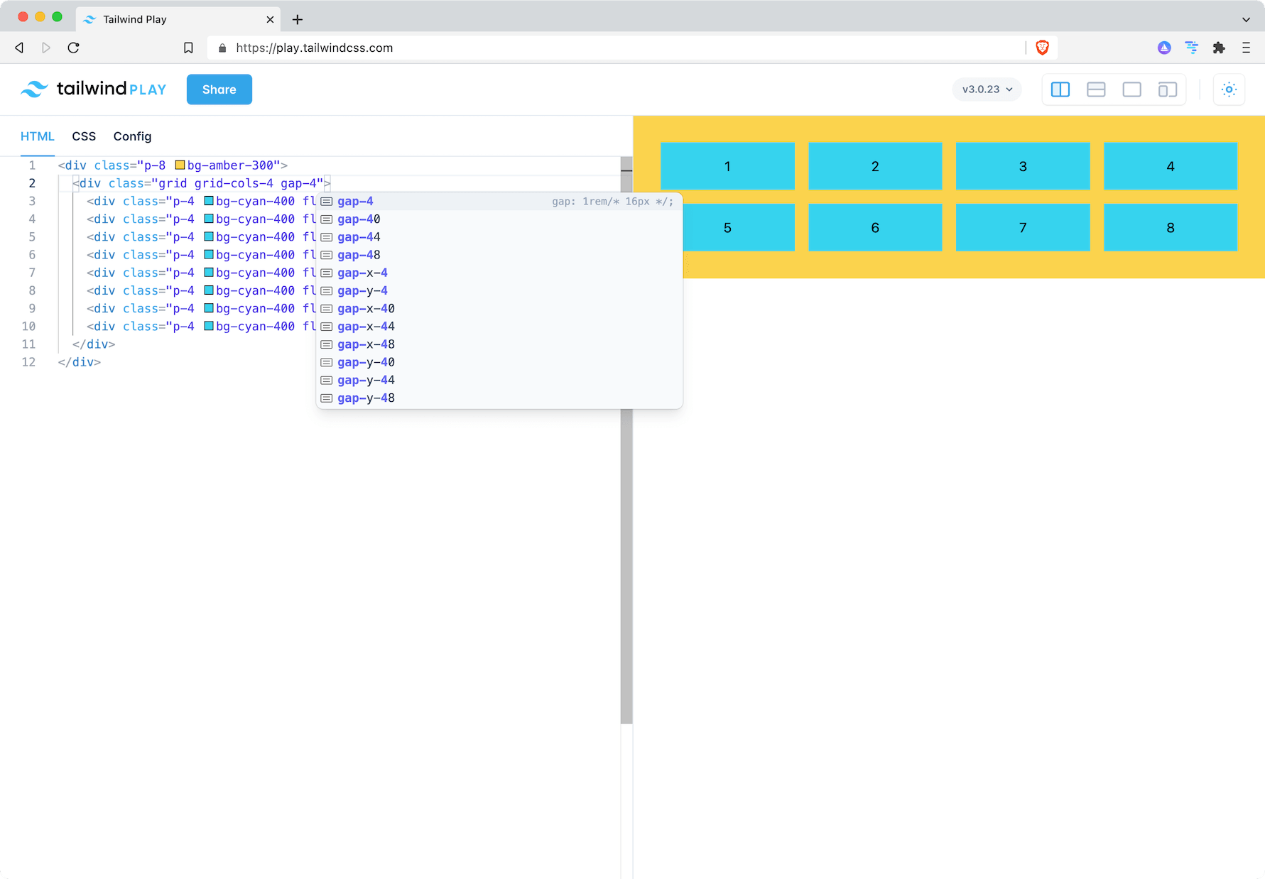
Adding space with the gap class
Now let's add some space between the tiles. Again, this works by simply adding a gap with the gap class.
Some minor tile adjustment to make them look nicer.
Going responsive
Making the Tailwind grid responsive works my using breakpoint prefixes. md:grid-cols-2 and lg:grid-cols-4 lets the grid automatically show the number of columns that works best for the viewport.
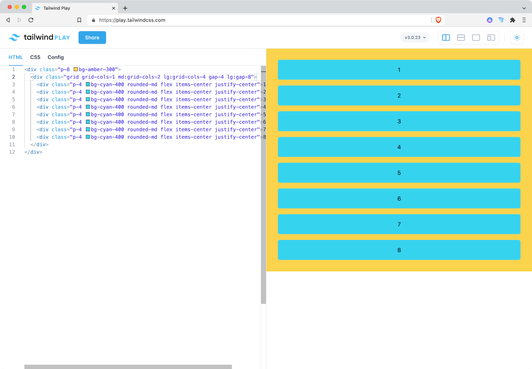
Final result
You can check out the final result at Tailwind Play.