
The most basic – but also most overlooked element of a design is spacing. This article explains how the different spacing utilities like padding, margin and space work in Tailwind CSS and when to use them. So if you are looking for a Tailwind Padding or Tailwind Margin tutorial, this is for you.
Base Setup
In our example, we want to position the DevTools for Tailwind logo in a box next to some copy.
<div class="min-h-screen bg-blue-50">
  <div class="">
    <div class="bg-[#7c9bdb] flex">
      <div>
        <img class="h-20 mx-auto" src="https://beyondco.de/img-blog/tailwind/spacing/devtools.png">
      </div>
      <div>
        The DevTools for Tailwind CSS bring back designing
        and debugging to your browser.
      </div>
    </div>
  </div>
</div>
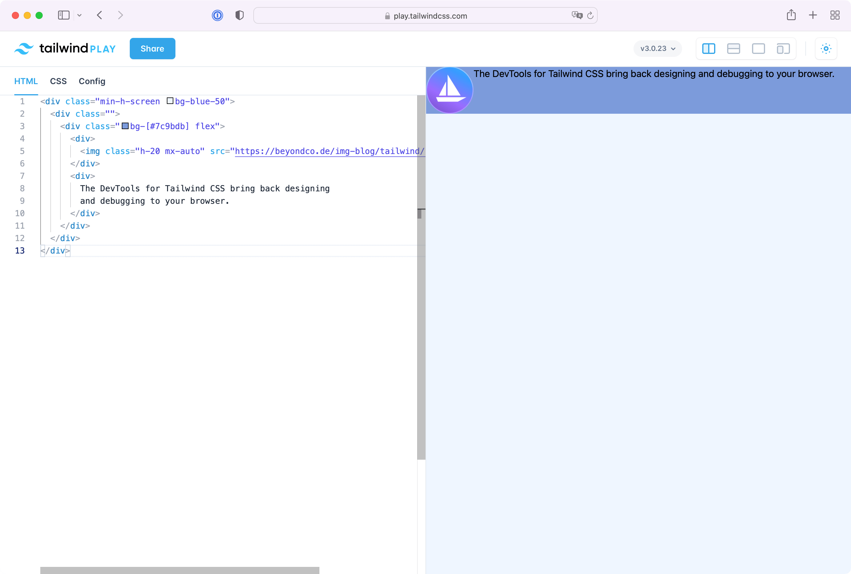
As you can see, this definitely needs some spacing. Let's start by adding some padding to the blue box and give the content room to breathe.
Padding Utilities
The padding of an object in Tailwind is the space that elements have inside. So if you add padding to an element, the elements within the elements get space. You can add padding to elements by adding the padding on all sites equally or by addressing them individually. p-4 adds padding to all four sides of a div and is the same as pt-4 pr-4 pb-4 pl-4. There are also short handles if you want to set only vertical or horizontal padding. px-4 is the same as pl-4 pr-4 and py-4 is the same as pt-4 pb-4.
Aside some minor layout improvements, the element looks much better with first adjustments on the padding.
<div class="min-h-screen bg-blue-50">
  <div class="p-8">
    <div class="bg-[#7c9bdb] flex rounded-md p-4">
      <div>
        <img class="w-44" src="https://beyondco.de/img-blog/tailwind/spacing/devtools.png">
      </div>
      <div class="flex items-center text-white font-black text-xl">
        The DevTools for Tailwind CSS bring back designing
        and debugging to your browser.
      </div>
    </div>
  </div>
</div>
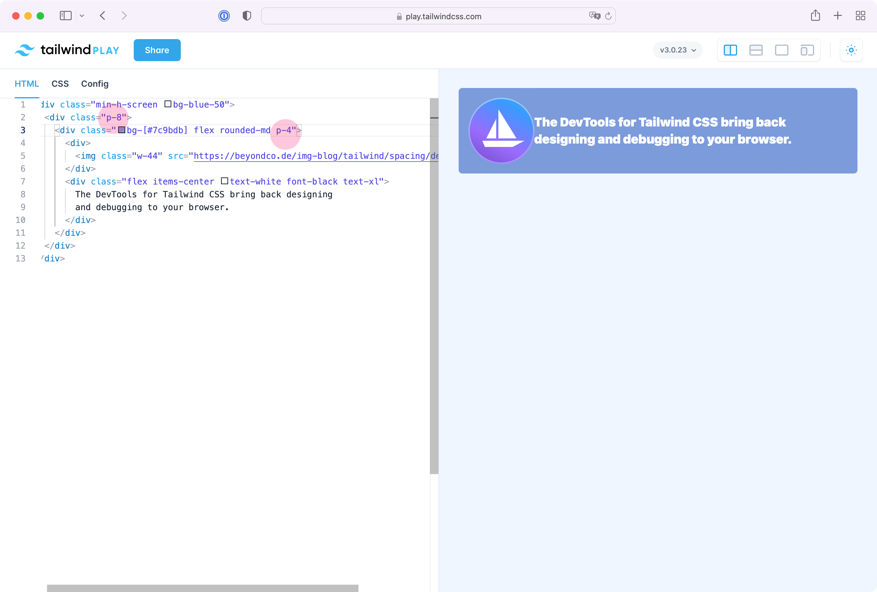
If we add another element to the site, it seems like the padding between both elements is off and using padding for these elements doesn't make much sense. Luckily, we can use the margin utility to fix that.
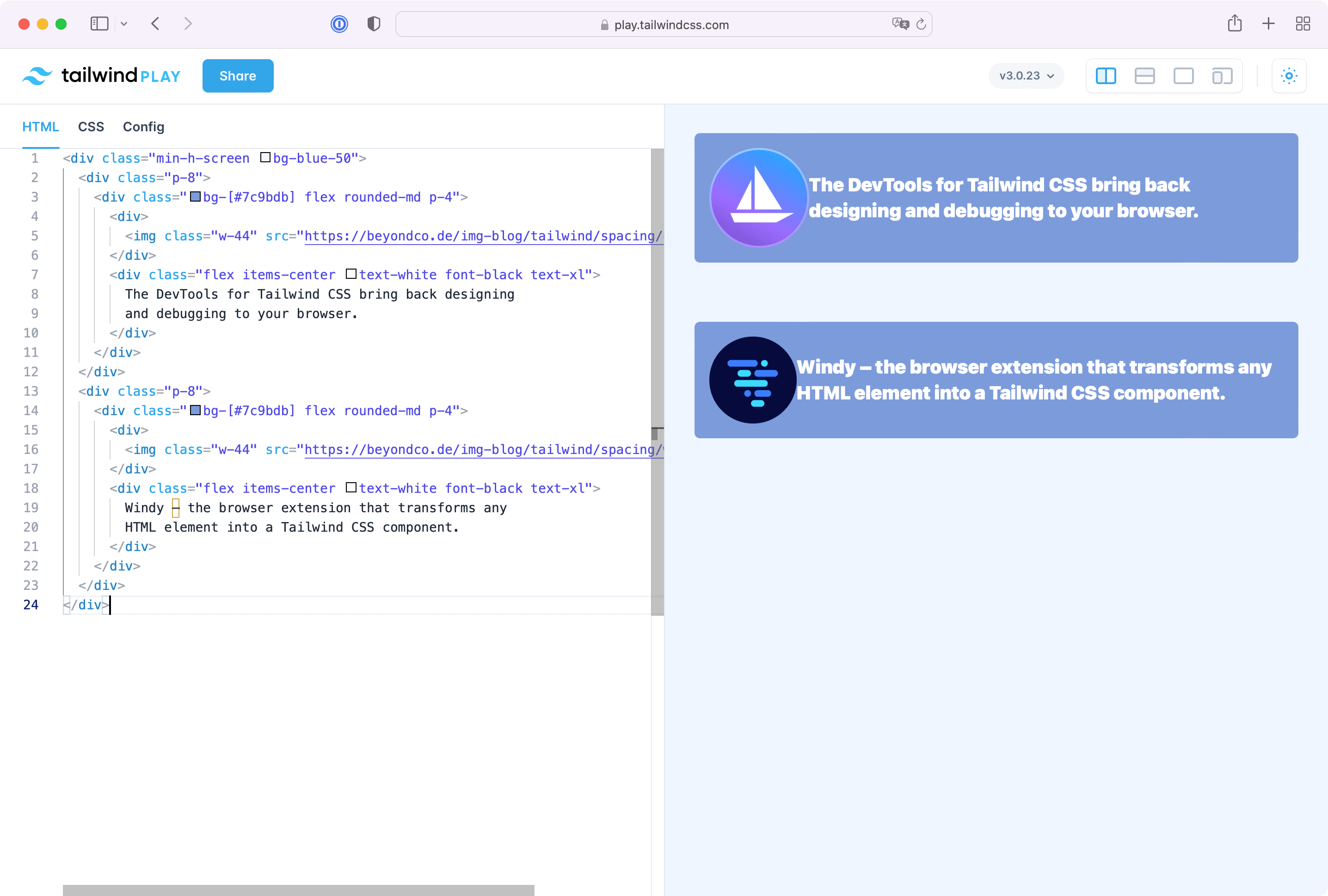
Margin Utilities
Margin is the space outside of elements. So while padding is inside (highlightet in red in the next screenshot) padding mt-8 is outside the element and simply moves it to the bottom.
The margin utility follows the same size scale like the padding scale but has a different effect on your layout.
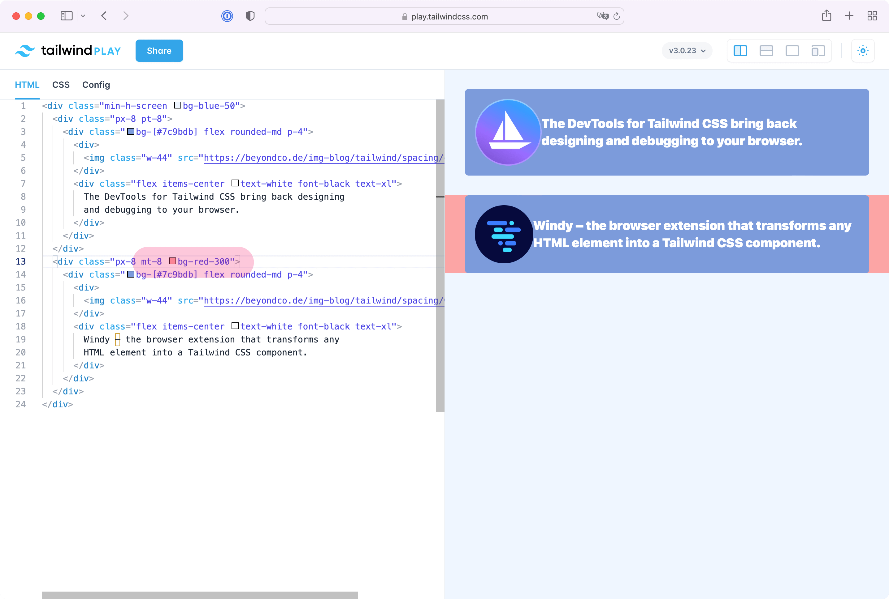
Negative padding and margin
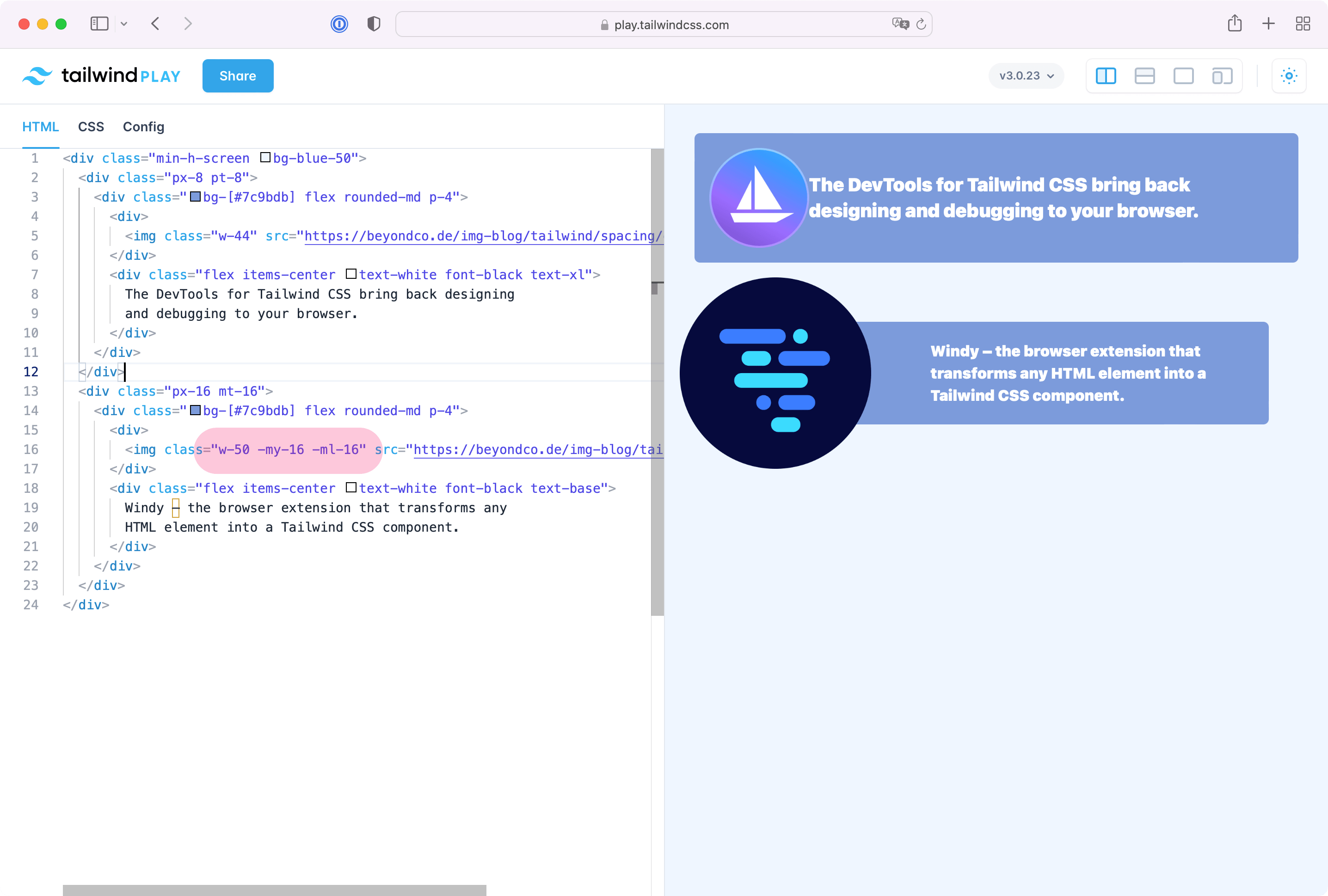
Padding and margin in Tailwind CSS do not only provide normal space but also allow you to use them in the opposite way by adding a - in front of the utility. -mt-16 moves an object to the top and even outside of it's container. This allows us to position the Windy logo in the next screenshot outside it's main box.
<div class="min-h-screen bg-blue-50">
  <div class="px-8 pt-8">
    <div class="bg-[#7c9bdb] flex rounded-md p-4">
      <div>
        <img class="w-44" src="https://beyondco.de/img-blog/tailwind/spacing/devtools.png">
      </div>
      <div class="flex items-center text-white font-black text-xl">
        The DevTools for Tailwind CSS bring back designing
        and debugging to your browser.
      </div>
    </div>
  </div>
  <div class="px-16 mt-16">
    <div class="bg-[#7c9bdb] flex rounded-md p-4">
      <div>
        <img class="w-50 -my-16 -ml-16" src="https://beyondco.de/img-blog/tailwind/spacing/windy.png">
      </div>
      <div class="flex items-center text-white font-black text-base">
        Windy – the browser extension that transforms any
        HTML element into a Tailwind CSS component.
      </div>
    </div>
  </div>
</div>
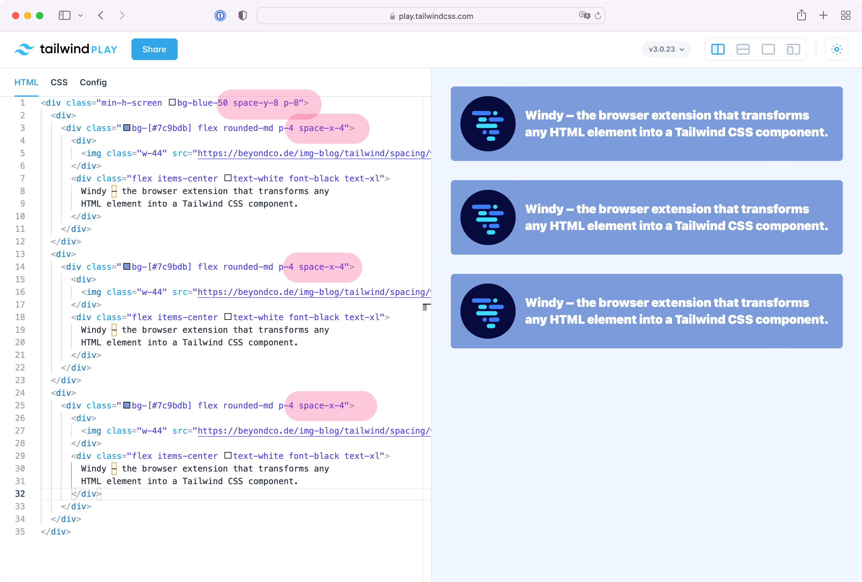
Space Between Utilities
Sometimes, you are repeating padding and margin utilities on every element and it could make sense to use the space between utility. As you can see in the next screenshot, we've replaced repeating padding and margin utilities and added space-x-4and space-y-8. These elements create space between elements and make it easy to only add space if there are more elements within a group.
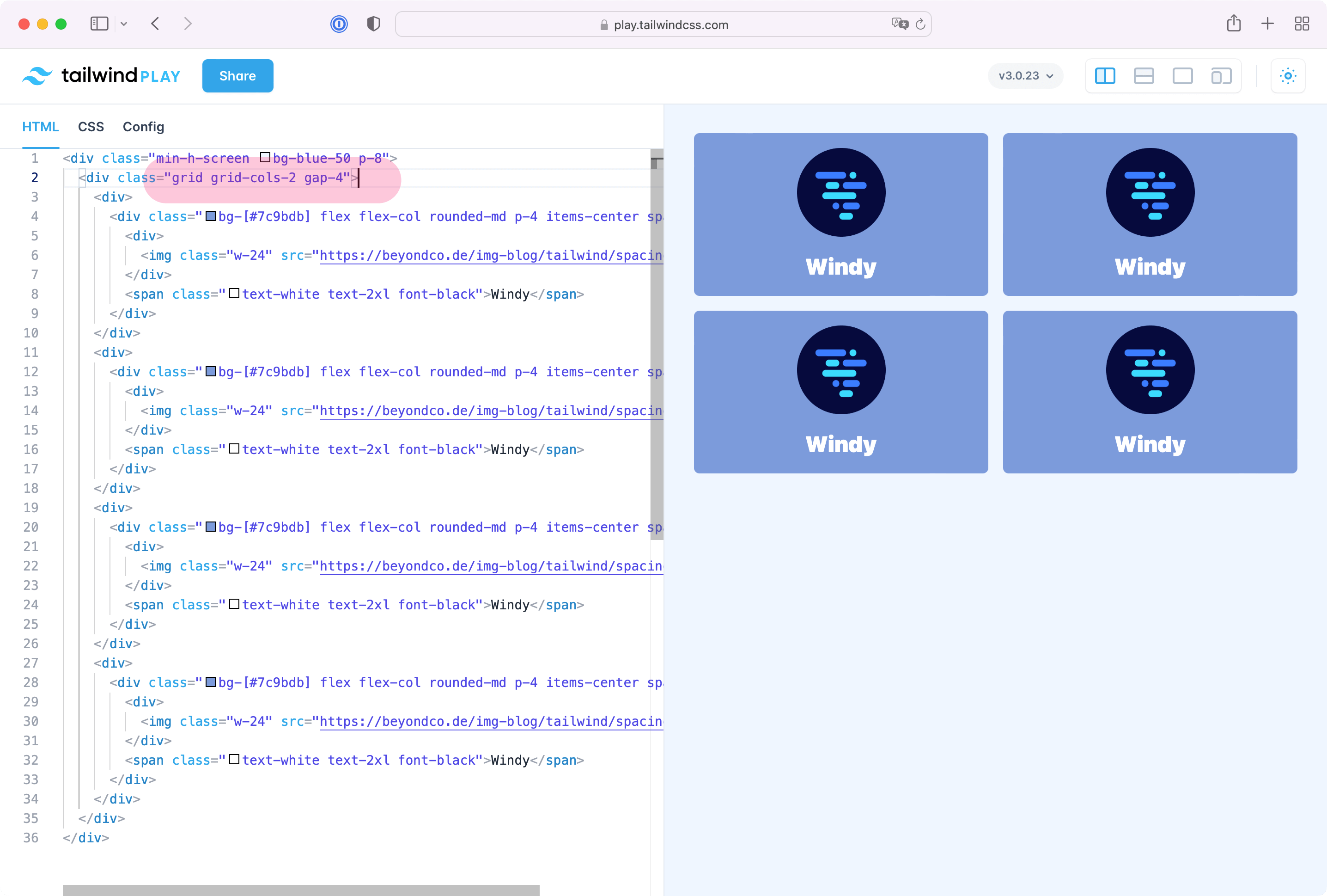
Gap Utilities
The gap utility works with Tailwind grids only and makes it even easier to add space between elements of a grid. In this example, we are adding space between all tiles of the Tailwind grid with the gap utility.
<div class="min-h-screen bg-blue-50 p-8">
  <div class="grid grid-cols-2 gap-4">
    <div>
      <div class="bg-[#7c9bdb] flex flex-col rounded-md p-4 items-center space-y-4">
        <div>
          <img class="w-24" src="https://beyondco.de/img-blog/tailwind/spacing/windy.png">
        </div>
        <span class="text-white text-2xl font-black">Windy</span>
      </div>
    </div>
  </div>
</div>
Example with a vertical gap
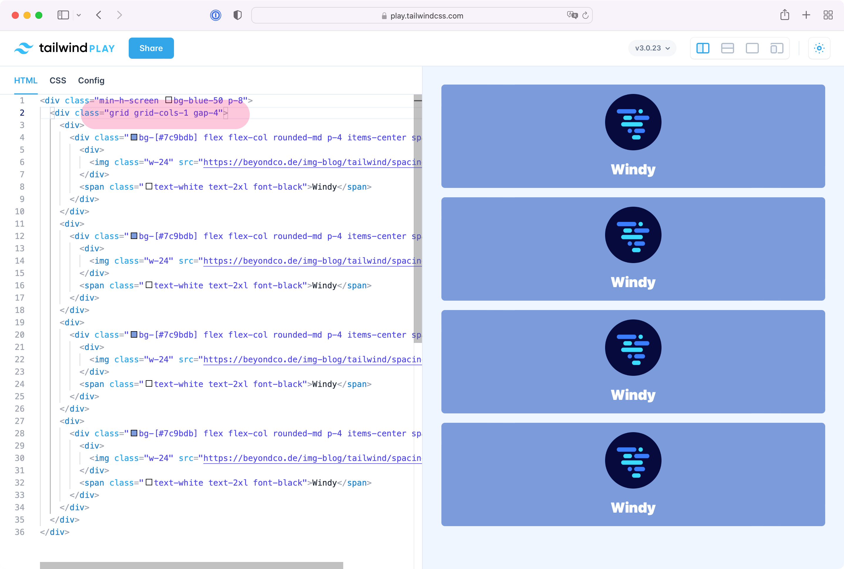
Example with a horizontal gap
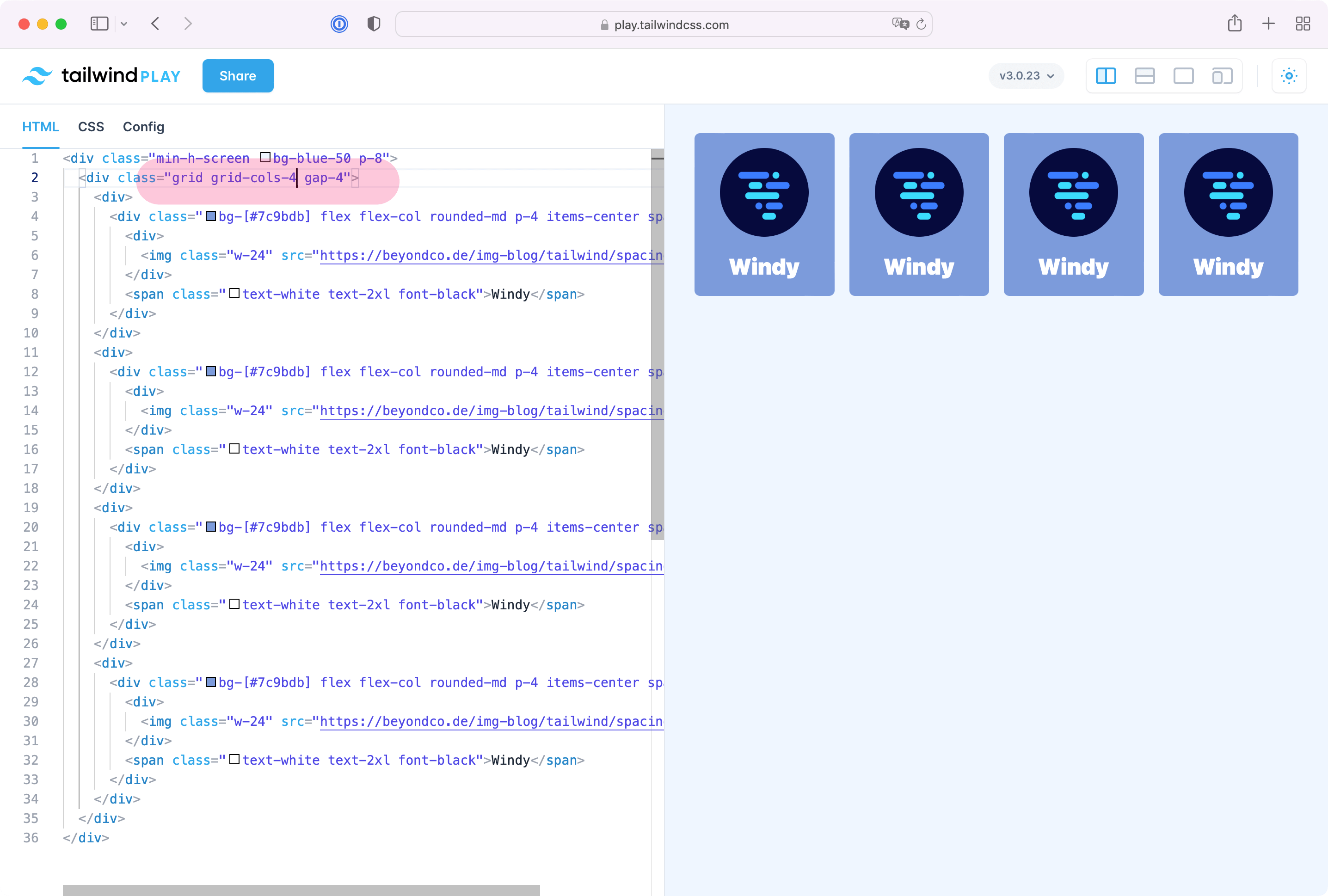
Example with gabs between all tiles
Using the gap utility to create margin/padding between elements of a grid makes this very easy in Tailwind. So whenever you design grids, use the gap utility instead of manually positioning the elements with margin, padding or space.